Color Swatches
Display different color options as color swatches to provide a visual representation for products with color variants.
Color swatches can appear in:
- The collection page (as a color filter).
- The product page (in the variant picker).
- The product card.
Types of Color Swatches
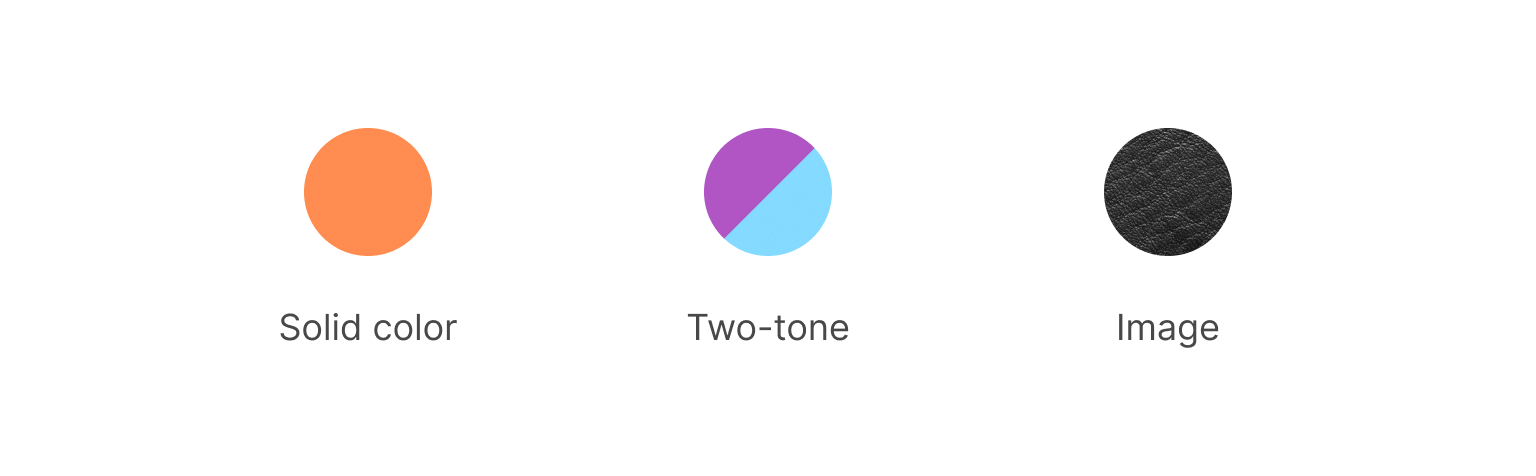
Essence offers three distinct color swatch types:
- Solid color
- Two-tone
- Image
Adding New Colors
While Essence provides standard swatches for basic colors, you can easily add new colors or modify existing ones by following these steps:
- Open Theme settings in the Theme Editor.
- Click Color swatches.
- Input your custom color swatch configurations in the Custom swatches field. For guidance on creating the configuration, refer to the Configuration Format section below.
Configuration Format
Here's a breakdown of how to format color swatch configurations for each type:
Solid Color
Red:#FF0000
Light blue:#00AAFF
Iris:#5D3FD3
Start with the color name, followed by a colon, and then provide the HEX value of the color. Each color should be on a separate line.
Two-Tone
Purple / Light blue:#B055C4#84DAFF
Black and White:#000000#F4F4F4
For a two-tone swatch, format it similarly to a solid color but append the second HEX value at the end.
Image
First, upload the desired swatch images to your Shopify store. To do that, navigate to Content > Files in your Shopify admin and click Upload files. We suggest 128x128px .jpg images for optimal clarity and quick loading.
Here's how to format the configuration:
Leather:leather.jpg
To define an image swatch, simply provide the filename of the uploaded image after the colon. Ensure the filename corresponds with the one listed in Shopify admin and includes the proper extension, such as .jpg or .png.